In a previous post I introduced the first batch of plots showing how the rates of police killings vary across median incomes in census tracts relative to their median county income, basically a measure of income where a police killing occurred relative to the county income.
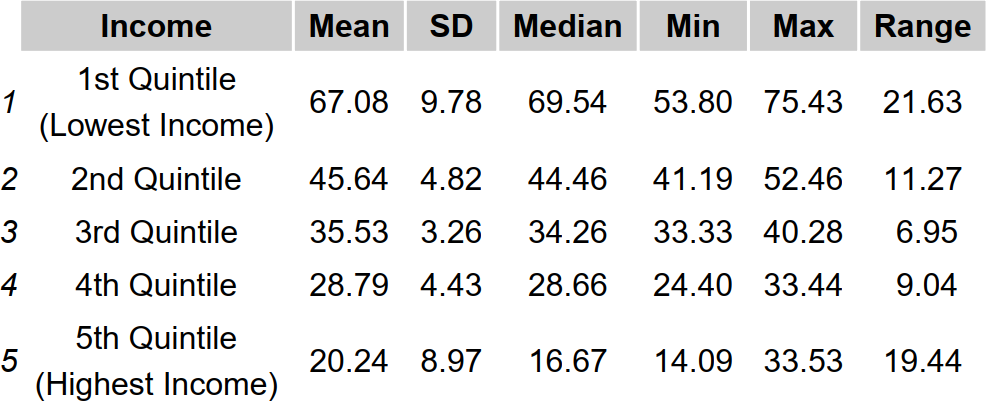
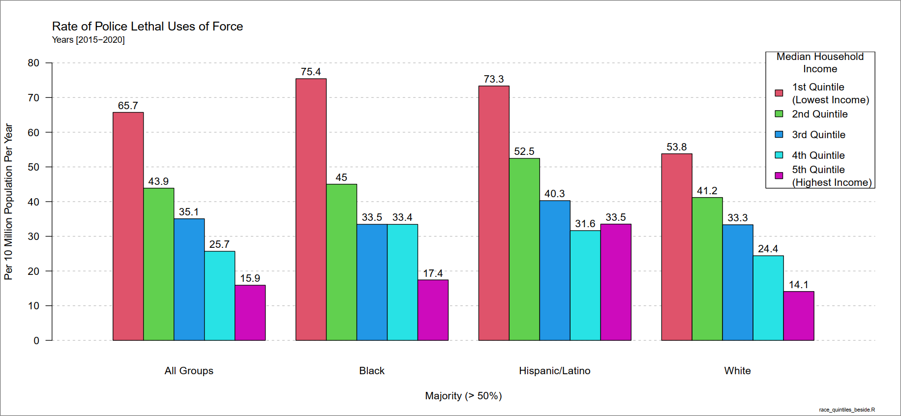
Instead of using relative measures, this time I am using absolute income values and breaking them into quintiles. I’m also displaying a lot more information on single plots, so that should make the implications more discernible for readers.
Additionally, I’m beginning to look at the Urban Displacement Project’s (UDP) data set. As of this writing, the data are limited to a handful of regions, but it’s still broad enough that I can make an initial plot. In a future post, I’ll extend the analysis beyond the 6 regions currently in the data set: Atlanta, Chicago, Denver, Los Angeles, San Francisco, and Seattle and their surrounding cities.
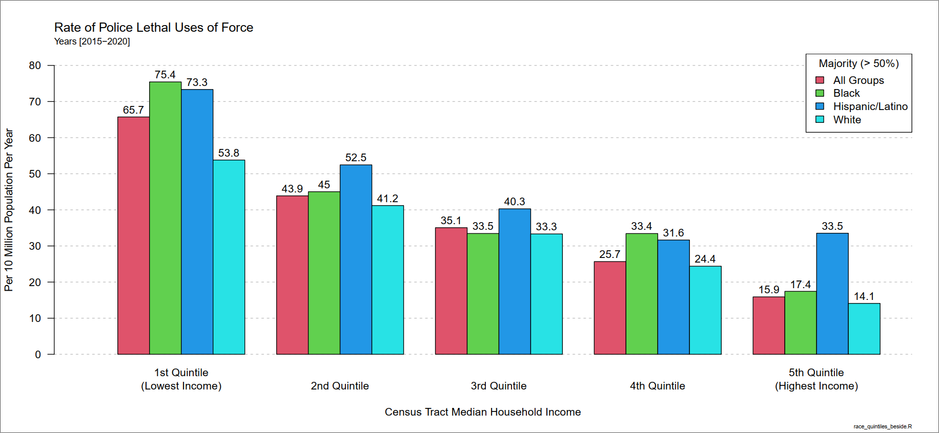
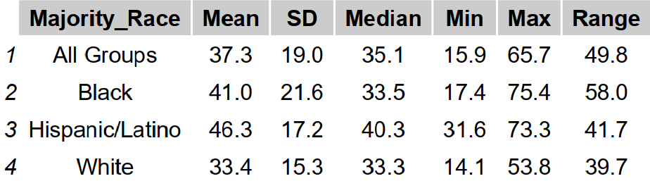
The plot above emphasizes how the rates of police killings vary within tracts in the same income quintile by racial/ethnic majorities. Notice how the rates vary more across income quintiles than across racial groups. The next plot, displaying the same data except emphasizing the variation within racial/ethnic groups will illustrate this point even more clearly.
Next, I’ll share the initial plot using the gentrification data from the UDP. It looks like tracts that are at-risk of gentrification have experienced the highest rates.
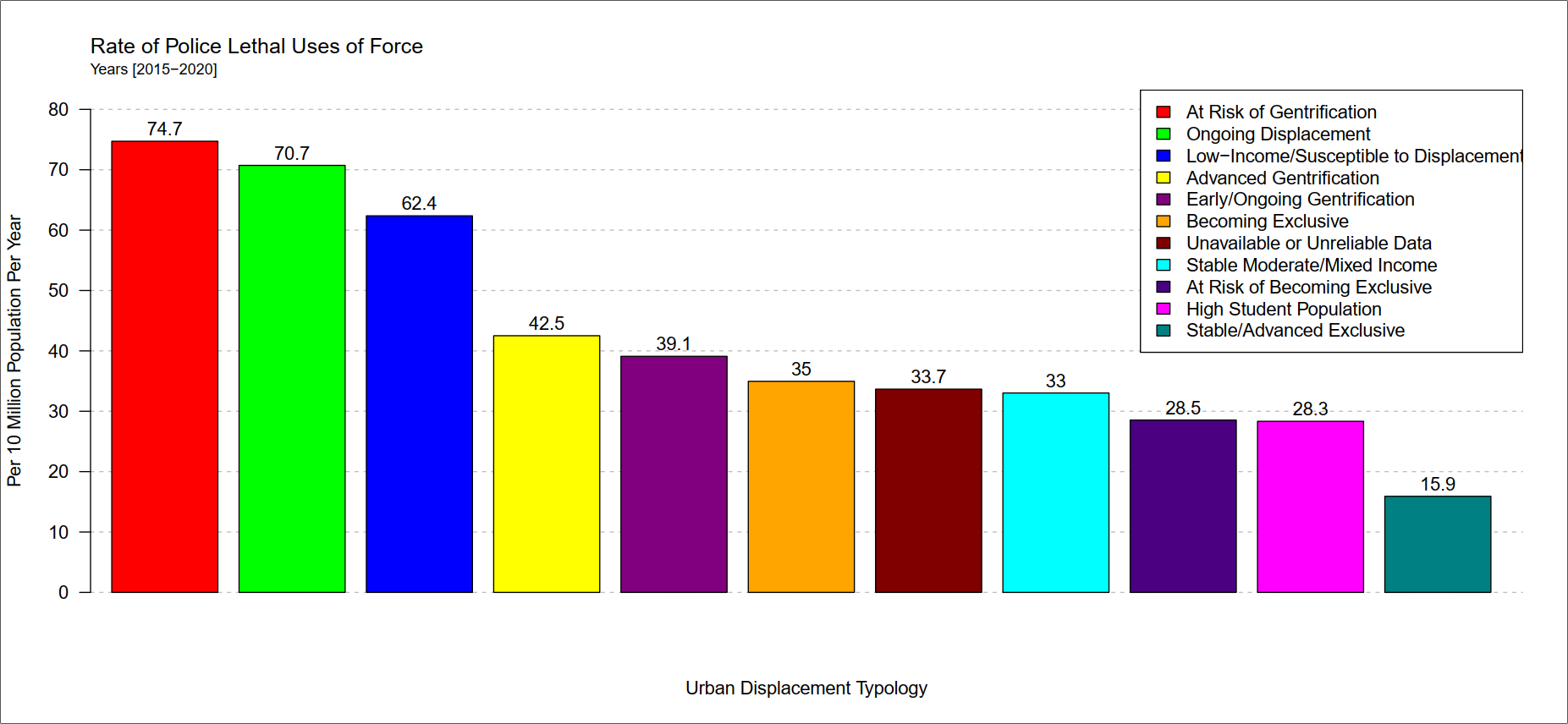
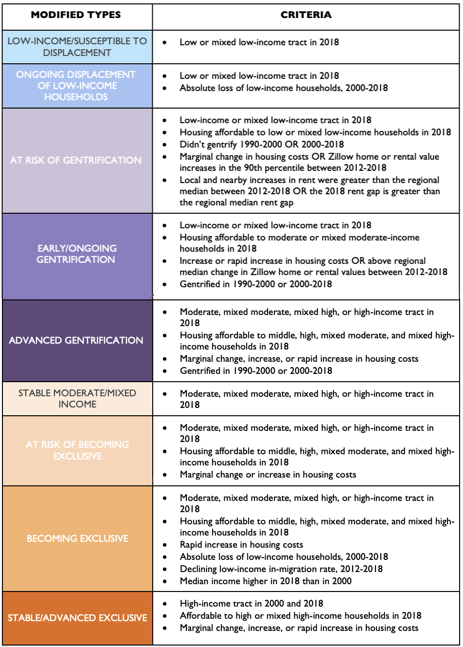
Here is the UDP typology.